Personal project
Banking Redesigned - Because It's Time: CAPITAL ONE | Personal
By Alyaman AlhayekUpdated
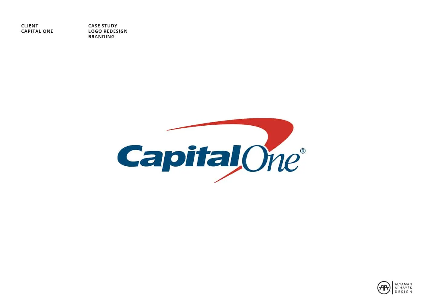
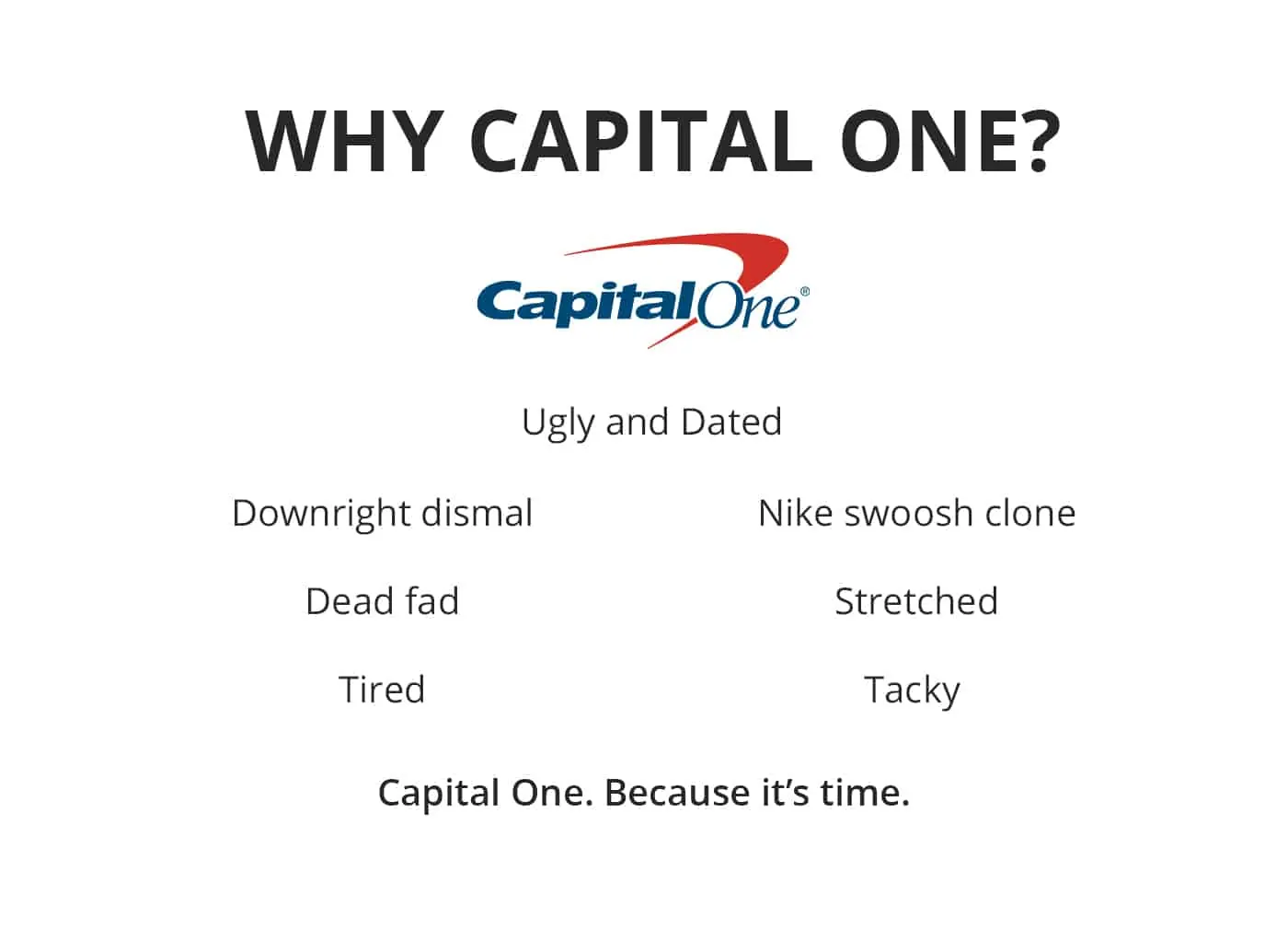
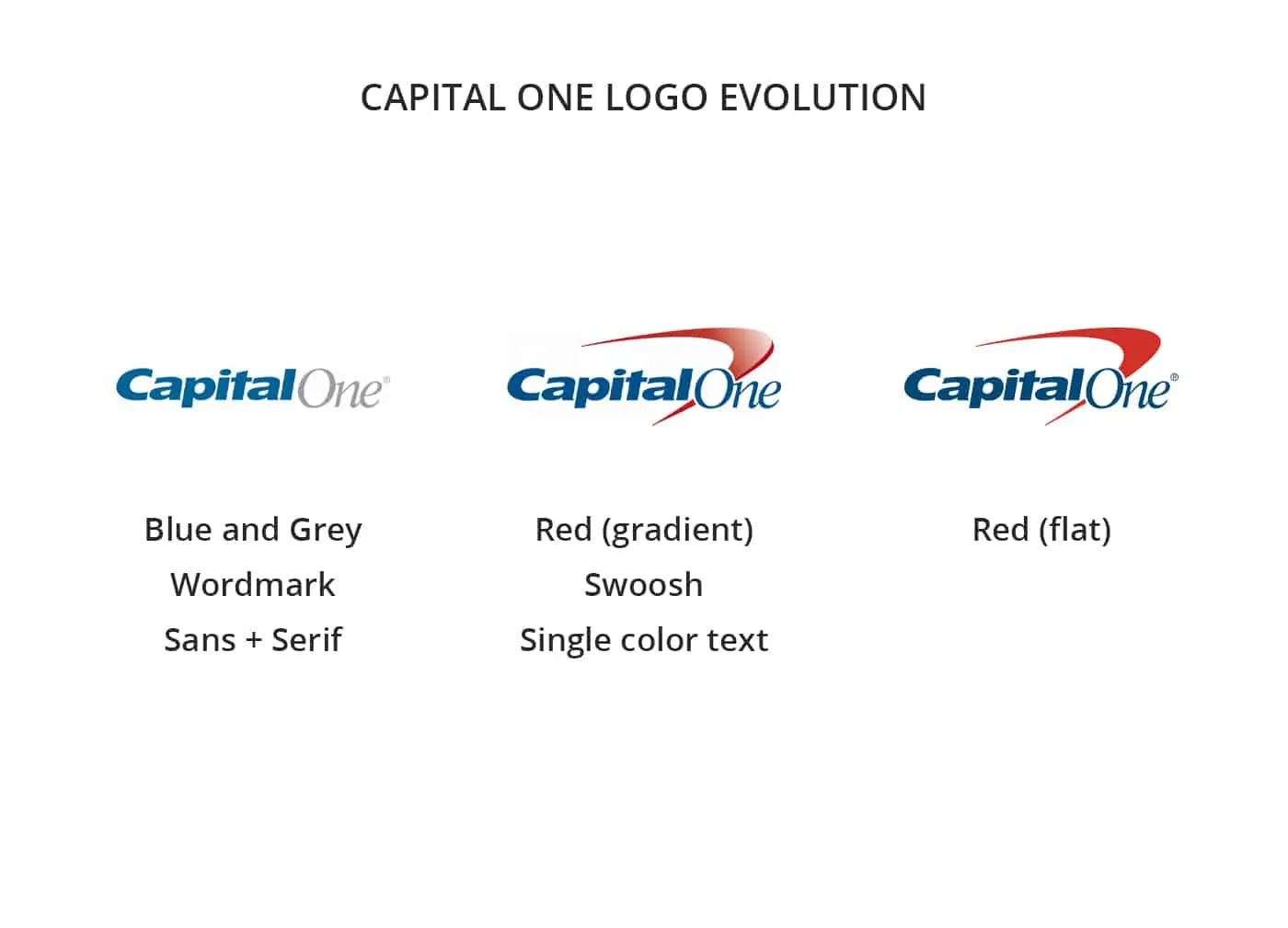
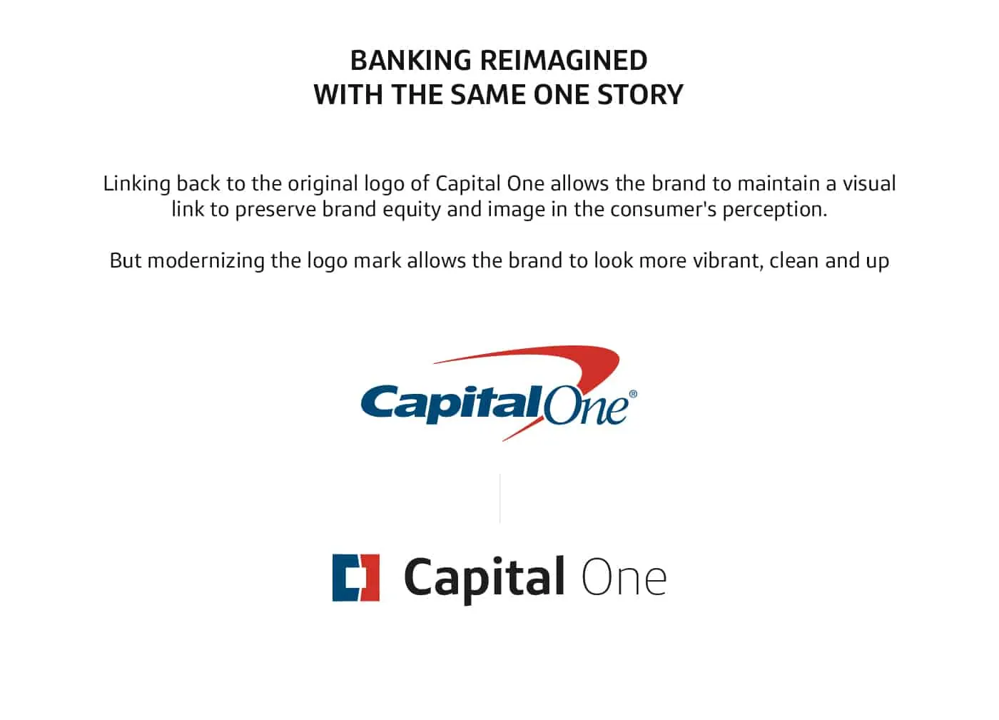
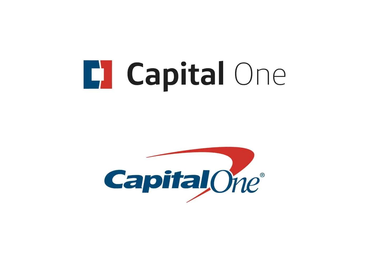
The Capital One logo is outdated using a generic meaningless swoosh. I took the challenge of redesigning it. Click here to see what I made.
Banking Redesigned – Because It’s Time:
CAPITAL ONE: A Personal Project
BRANDING, BRAND STRATEGY, LOGO DESIGN
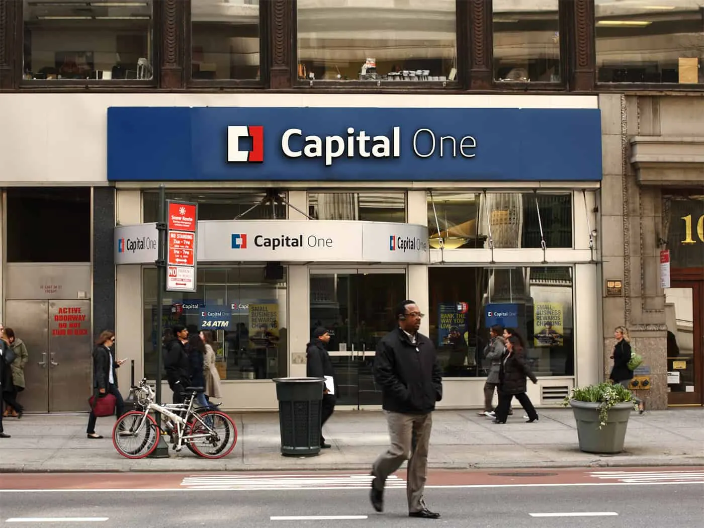
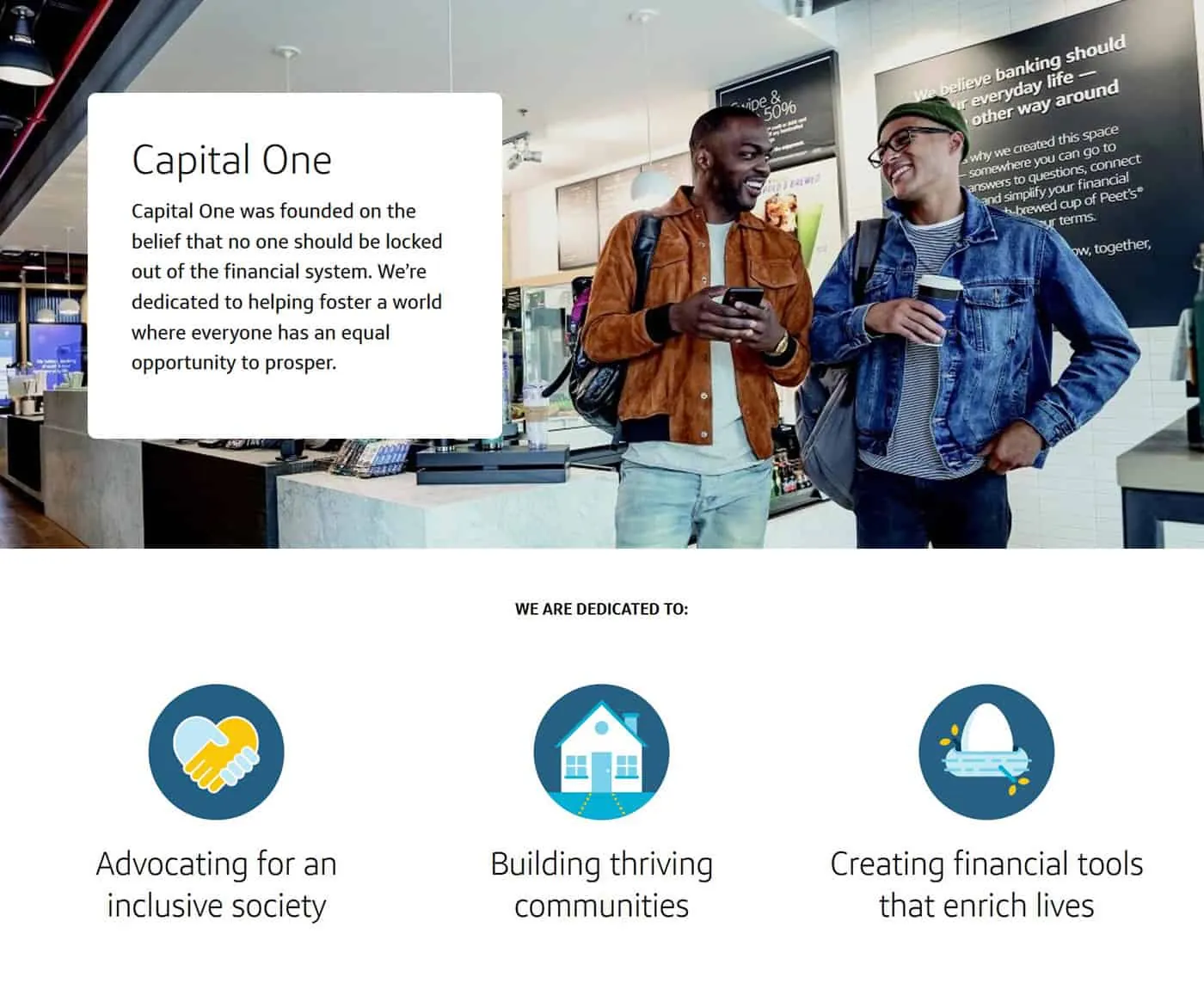
Capital One is an American Bank holding company with hundreds of locations all over USA and parts of Canada and the UK.
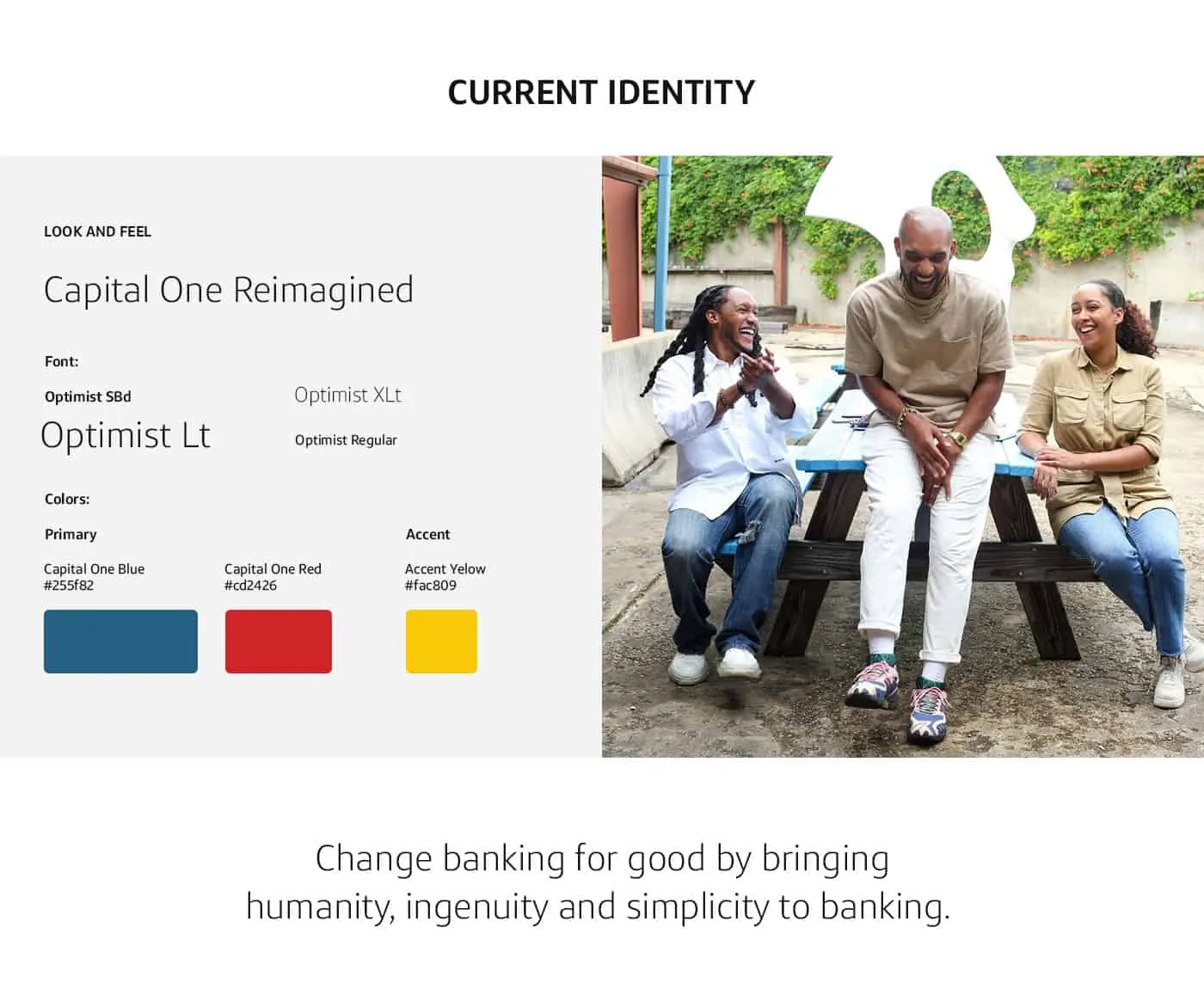
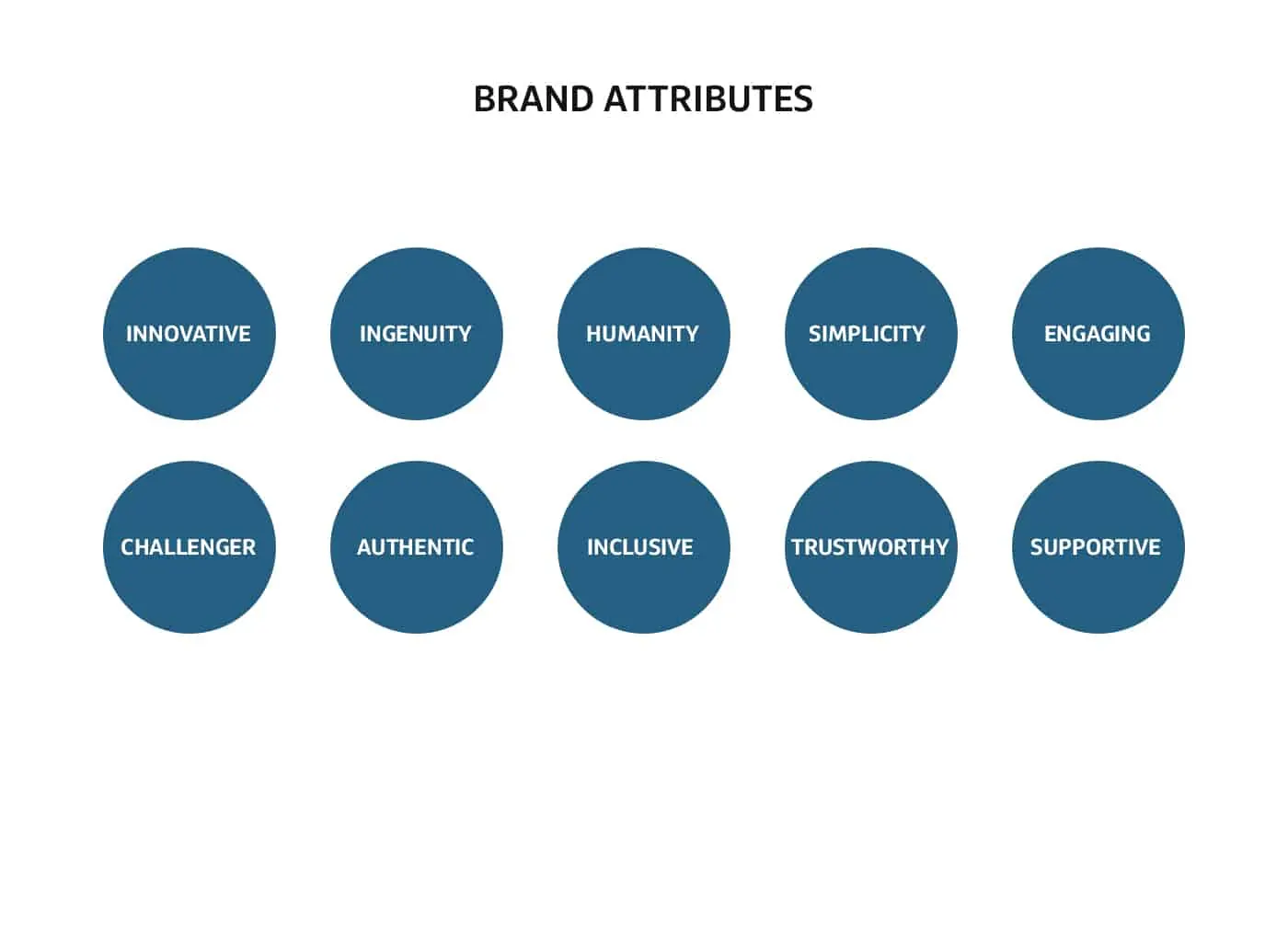
Capital One is on a mission to change banking for good by bringing humanity, ingenuity, and simplicity to banking.
CHALLENGE
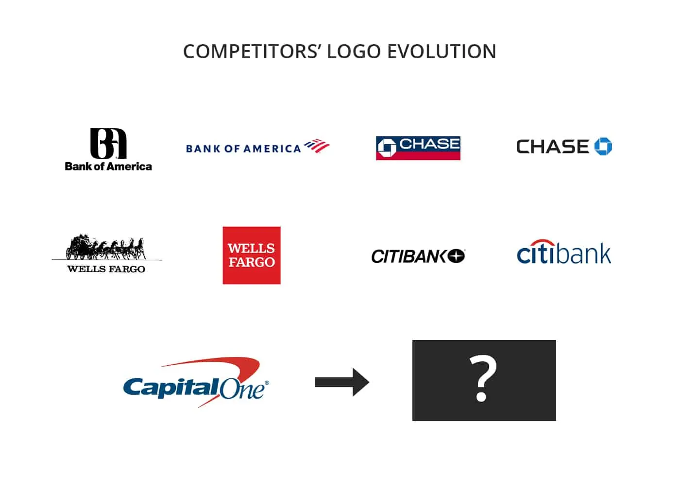
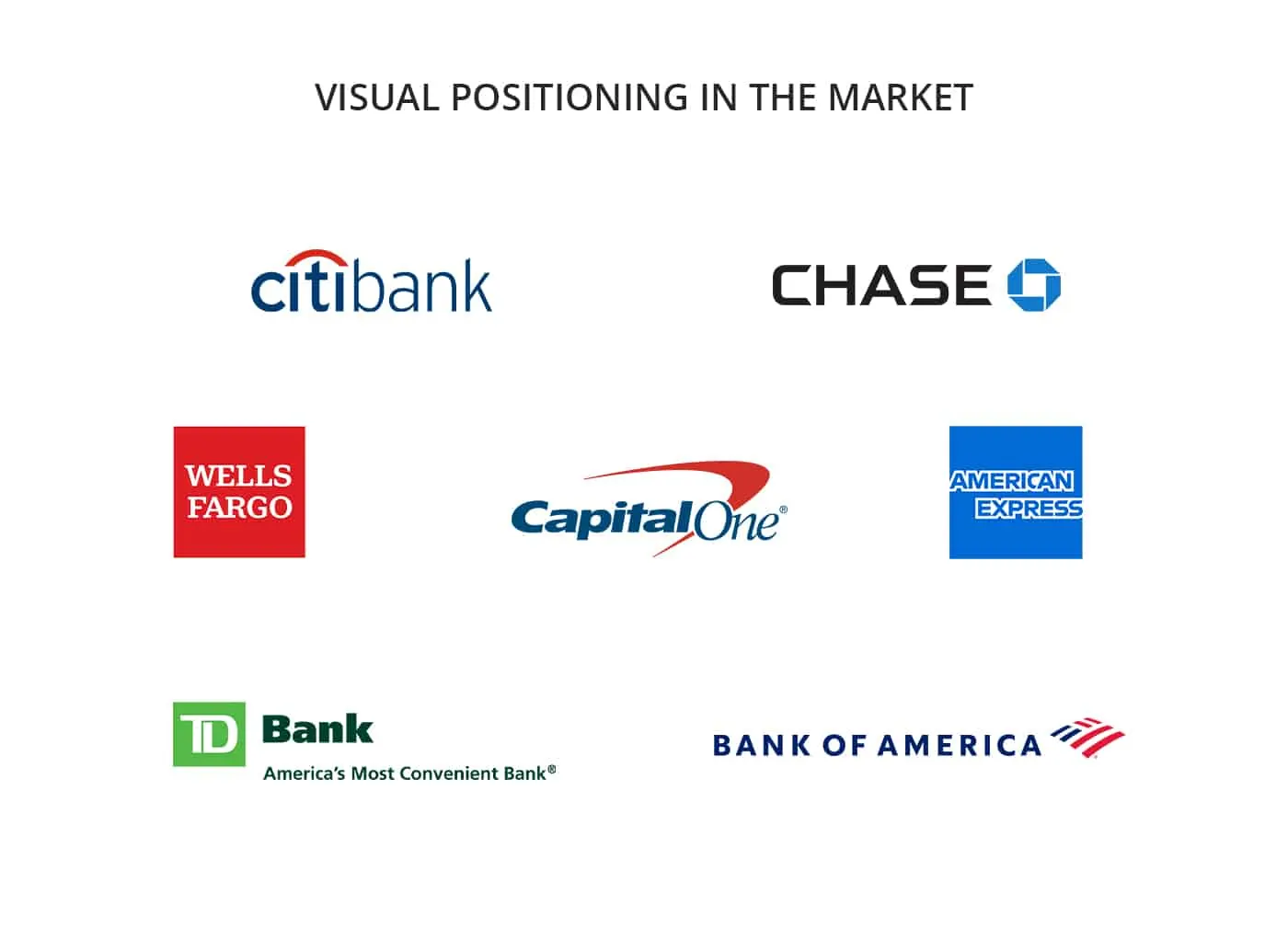
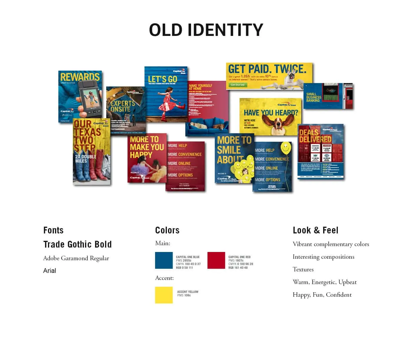
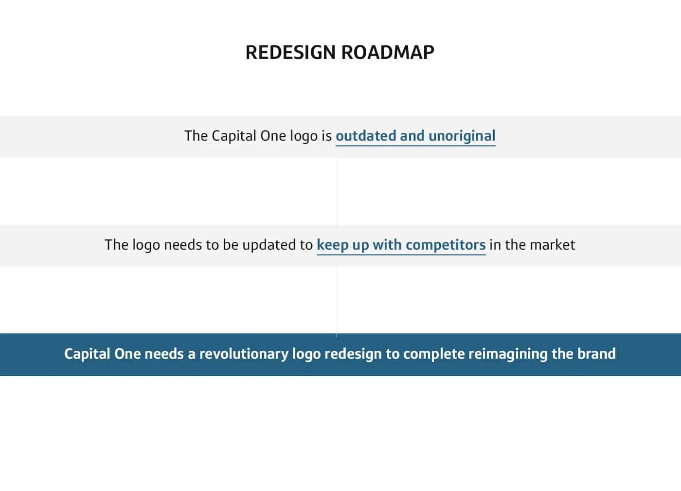
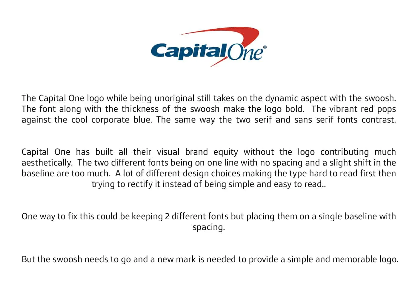
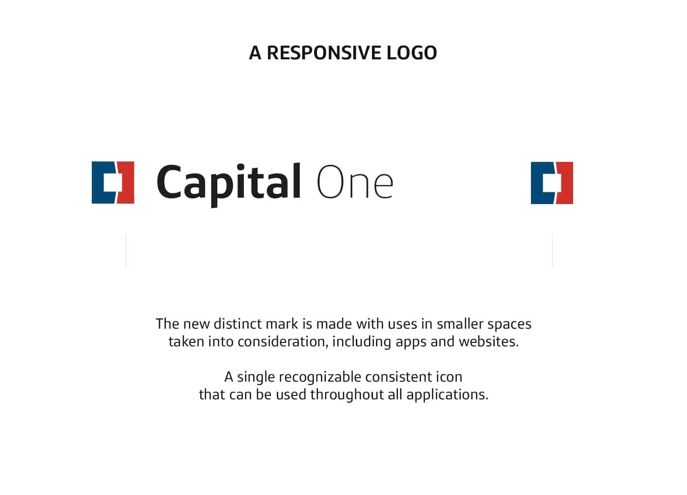
Capital One needs a new logo, a change from the outdated swoosh. As tons of money is spent in marketing and advertising each year, the logo needs to be something that is timeless but memorable.
OUTCOME
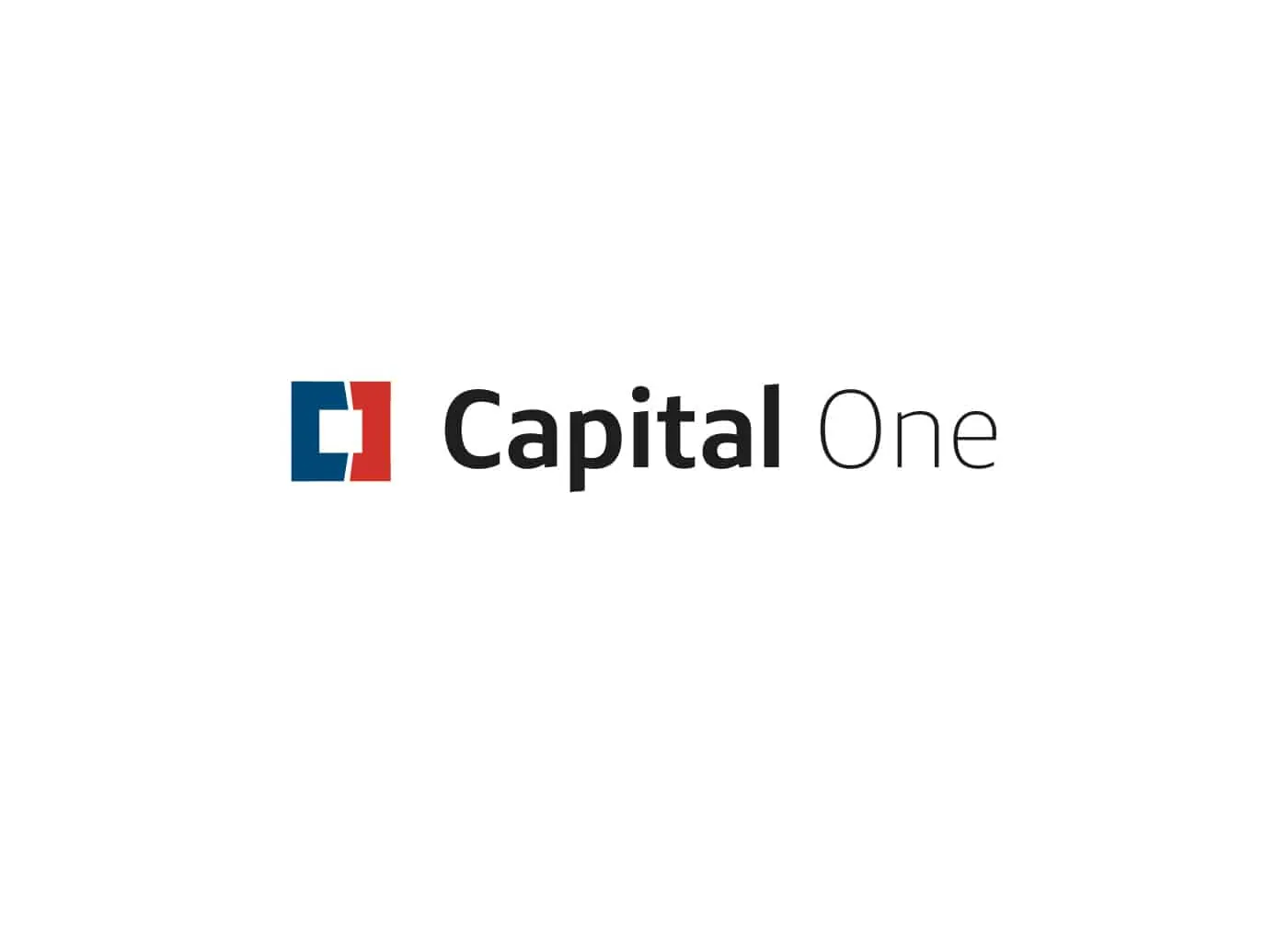
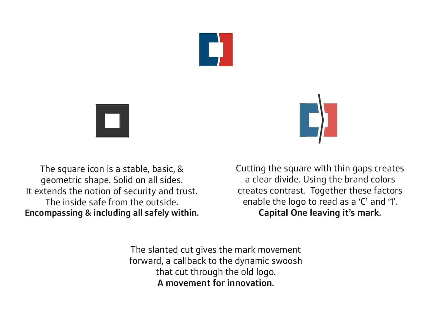
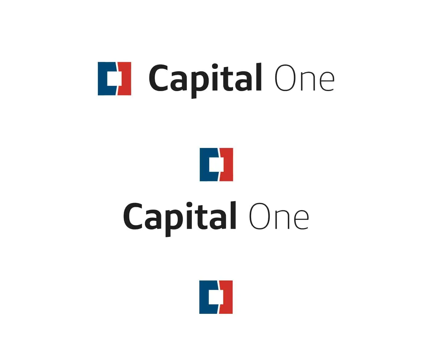
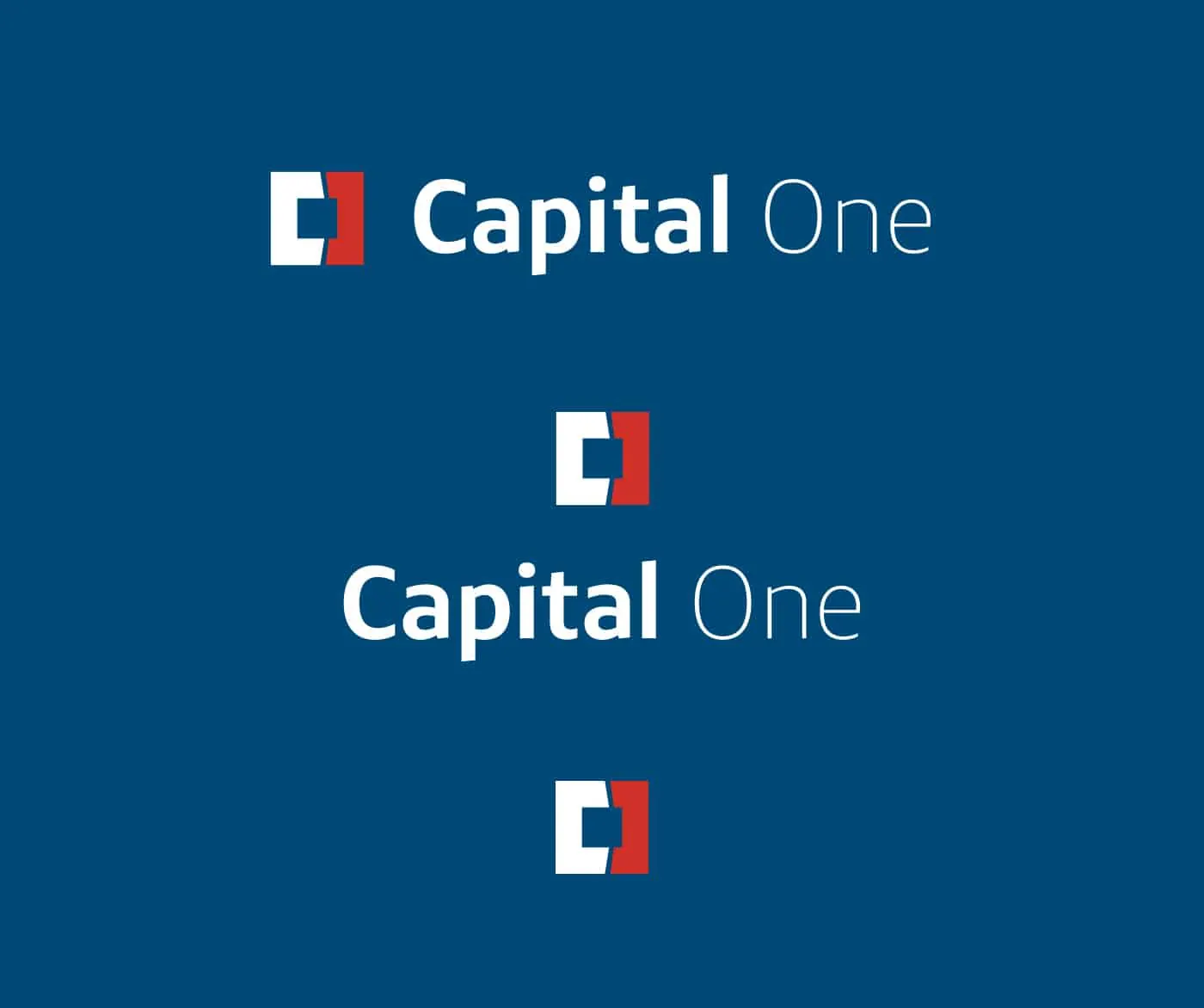
A design worthy of the brand and company behind it that continues to grow. A simple mark that stands out while having meaning grounded in the Capital One brand.
STRATEGY
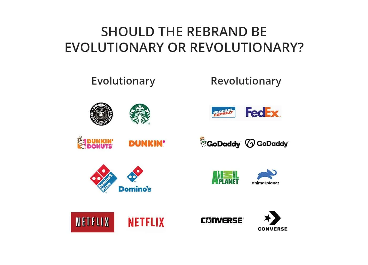
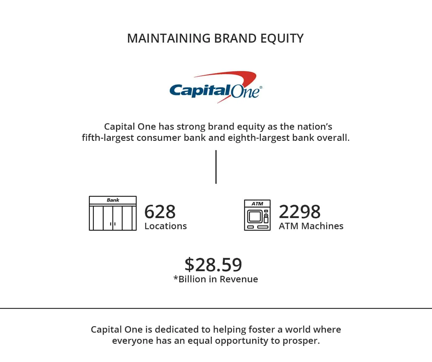
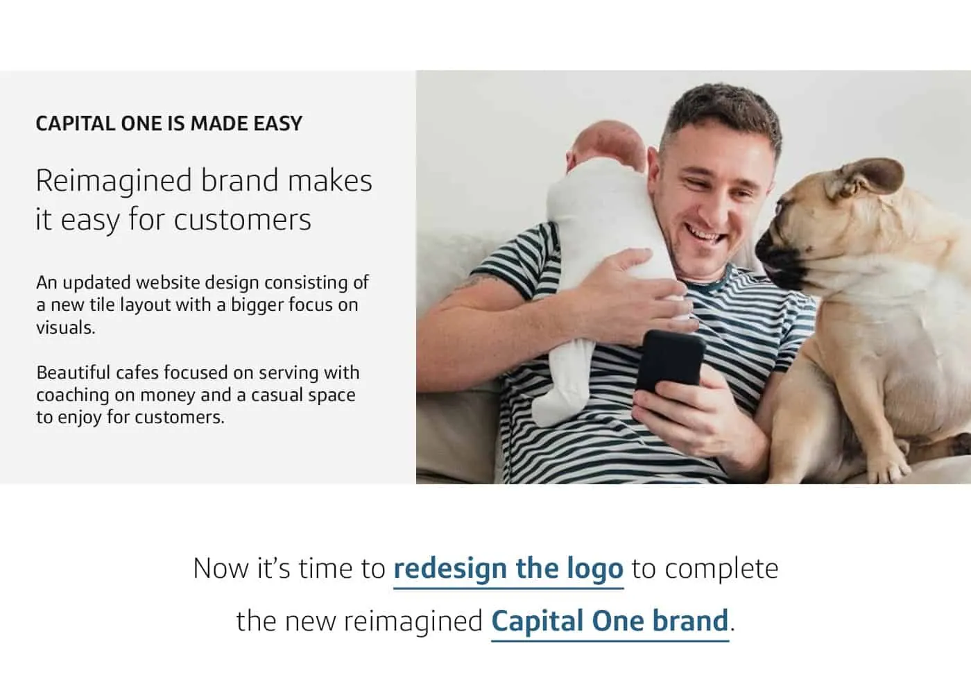
LOGO REDESIGN
APPLICATION
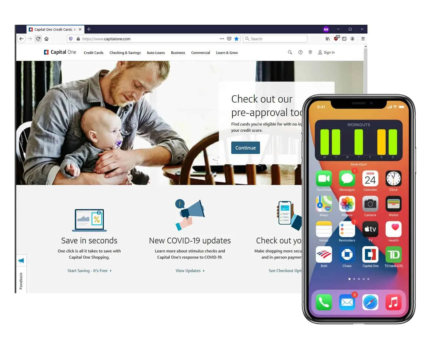
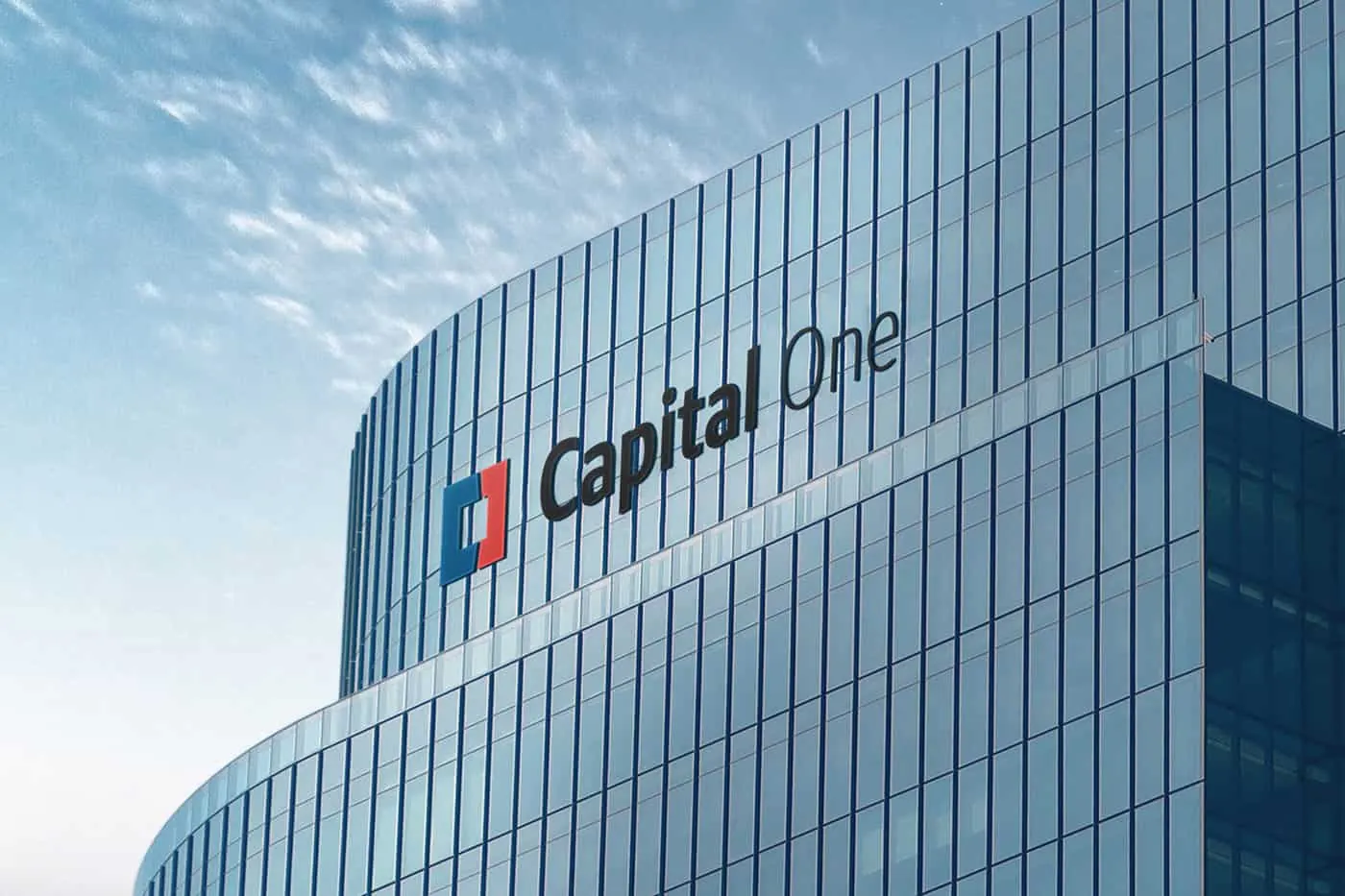
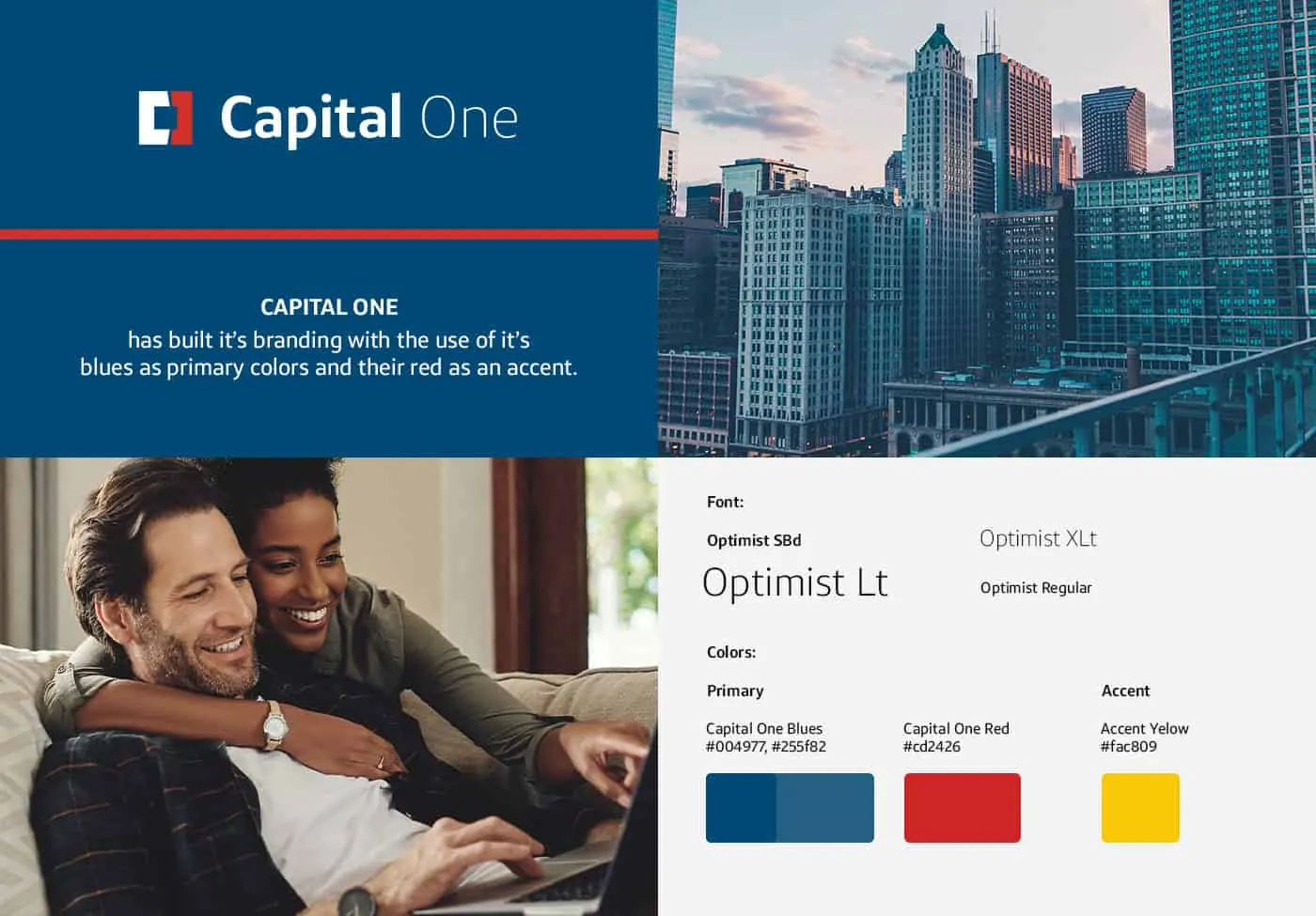
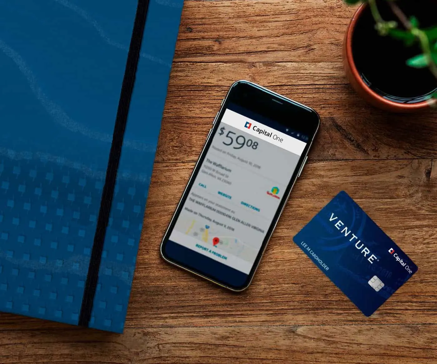


RESULTS
Capital One now has a logo they can truly call their own.
A unique, memorable, and strong symbol. Authentic to the Capital One brand, no longer an outdated meaningless swoosh.
Capital One seeks to re-imagine banking. With this new logo one step is taken towards that goal.
Capital One with this new logo is banking redesigned.
Want to work with us?
Want a website that people actually find and use? See my website design services.